ShopDreamUp AI ArtDreamUp

Deviation Actions


Comments108
Join the community to add your comment. Already a deviant? Log In
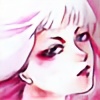
This is a very interesting illustration of a forever-green concept: that of the eternal battle (or better said, antithesis) between good and evil, beautiful and ugly, light and dark (and all other derivates).
However, I don't see the beast anywhere in the work - not physically nor even suggested. The characters are beautiful, and supposing the beast would be the man - he has nothing evil in it. Very feminine face, loving look in his eyes, shiny hair etc.
Everything is flowery, whimsical, dreamy, surreal I'd say. The girl is in the most peaceful sleep, waiting to be woken up by Prince Charming (which, "the beast" seems to be) So this is more like "the sleeping beauty" for me.
But this is only a title matter.
Some words about technical stuff: I admire your patience to do all those little details, just be careful not to overload the work with stuff. There must be some spaces to let it "breathe", where the eye can rest while watching it. It can be very consuming to try and cover everything, and when you take a closer look it's easy to get lost in there. There are a few empty spaces (on the flowers in the bottom, or the blank space in the left side) but just a little more will do the trick. In the rest, everything is so detailed -and all details are equally important and showcased (nothing blurry, nothing ignored) that it's hard for the eyes to focus on one thing.
A very important thing that any work needs: is the so-called "interest centre". The thing that catches the eye first and which is the most important zone of the work. I can't figure out which is the interest centre here: Is it the girl? the "beast"? the flowery patterns? From the composition, it might be the man's face, because all lines lead me there (the line of his back, the black scarf, his right hand) but at a closer look, I guess the most important zone of the drawing must be her face and his finger there (I might be wrong about this so feel free to tell me if it's so). Also, be careful at the subtle things: the work is split in two equal sides: from the bottom-right corner to the upper-left one. The black scarf, his right-hand sleeve, the leafs. The upper side is fuller, darker, almost crumbling over the feminine, fragile side of the work so this might be a subliminal message that evil ("the beast") is on top, and it's overwhelming and the good is in it's deepest sleep doing nothing against it. I don't know if it was intentional or not, but in general equal-sided compositions are to avoid (unless, of course, you have a strong concept behind, like in this one)
um.. what can I say more? I personally like it very much.
I think it's a great illustration, very subtle and inspiring <img src="e.deviantart.net/emoticons/s/s…" width="15" height="15" alt="
Congratulations and keep up the great work <img src="e.deviantart.net/emoticons/h/h…" width="38" height="15" alt="